Sunday, April 26, 2009

Final Friday - Emily Ritter

Sorry for the late post. I have been battling with our internet since Thursday night. I completely lost.
Final Friday was pretty interesting. I wasn't impressed with a majority of the galleries. Honestly, I am sick of seeing high school "art." Yet again, I really wasn't impressed with Shift Space. I did like what city arts had up. It took me awhile to figure out how the photos looked the way they did. They were super sharp and looked unreal. I liked the contrast of the blurred images against the sharp ones. At the Tangent Lab, my favorite piece was I think Janice Hobbs "Nude Male." I think that is what it was called. It just reminded me of Henri Matisse's blue nude painting, which I LOVE!!
That is all.

AHH!

I guess most people wouldn't consider a color expert or a cosmetologists an artist but I have a new respect for them. Over the weekend I decided to go a shade darker.. or that's what I had in mind. I bought a home coloring kit that was suppose to have a mild darkening affect according to the color chart.. I dye my hair and I'm shocked. I am now a reddish brunette. It takes skill (or at least skill in my eyes) to be able to dye hair and actually get the desired color. A friend of mine also had a discoloration accident this weekend. She decided to use a self tanning lotion. This friend is extremely pale and mized with the henna/bronze color.. I suppose her skin had such a tint that it turned orange or at least it was more obvious. This gave me an idea to look up artistic hair styles and body art.

Craig Tracy is an interesting body painter. I did like his work but to me some artist get to caught up in commercializing their work and you can't figure out how to just LOOK at their WORK http://www.paintedalive.com/ This is one of my favorites: http://www.paintedalive.com/HTML-WWW/speed-g.html

I also learned about a local artist by the name of Dennis McPhail who by reputation is known as one of the best regionally. http://www.worldtattooauthority.com/metadot/index.pl?iid=2858&isa=Category Sadly I couldn't find any images of his work unless I searched Google for " Dennis McPhail art" but I do think it is a good idea that he combines his love for art and cars. It kind of shows that something you are passionate about can become a career.

Saturday, April 25, 2009

Final Friday Crawl

Well, I got a late start last night. I did make the scene at Blank Page, Shift Space and City Arts.
Frankly, I felt the best art I viewed was at Blank Page where Maize HS senior art students had a large exhibit. This art excited me and made me change my facial expression several times. The ceramics blew me away. My favorite piece was one entitled "My Space". It is a ceramic sculpture portraying a two story environment with a ceramics studio on first floor and bedroom on second floor. These rooms are set in a corner arrangement of adjoining walls with the front and top open like doll's house. Monochormatic earthtone coloring with textural elements and shading. This exhibit was much more interesting to me than that at Shift Space for several reasons. First, the space was filled with work, and second there was lots of diversity of materials. There were several nicely rendered drawings and lots of color. Shift Space was virtually empty in comparrison and its white walls and stands where the works were displayed overwhelmed them. Repainting the walls to divide the space and set off the individual pieces might have helped. There was an exhibit of very large photographs with a Kansas theme at City Arts. The architectural ones were slightly interesting because of unusual angle of view. Manipulation of color and some layering would have rendered them ART for me. As it was these were just plain old pix only big. The ones with animals had more to say to me because of the subject matter only. Again, just big pix. I spent about ten minutes looking at them.
And that's all I have to say about that. Margaret

Ah! I'm late!

Oh well. At least now I'm up. But in defense of myself, I was at Final Friday last night. Out of all the places I went, my personal favorite was the print work done at The Diver. The subtle comedy and commentary in most of the pieces was just delightful to me. However, I also really enjoyed the mix of media and technique. It seemed no one image used just one style. The mix was very interesting and unique. I enjoyed it very much... even though it was about 100 degrees in that loft.

-Aerica

Friday, April 24, 2009

Sick

Well, I was planning on going to Final Friday tonight, but I've been feeling under the weather for the past few days. So instead, I'll share something I found on NOTCOT awhile back. Most people probably don't know this, but one of my biggest passions/hobbies is smoking hookah. For those of you who don't know, it is a waterpipe used to smoke flavored tobacco. I've helped manage two of the largest hookah communities online, and I have quite a collection of my own.

Anyway the link is http://www.notcot.com/archives/2007/09/narguile_by_ned.php. . Also for more of this collection look at http://www.airdiem.com/en/en.html. After looking at these, I came to the conclusion that these hookahs are based on form rather than function. Having experience in multiple styles of hookahs, I know that these particular hookahs are meant for decoration rather than practical use. I honestly don't even find these designs aesthetically appealing. I prefer the handcrafted Egyptian, Syrian, and Turkish hookahs. I see those as true pieces of art. Not only do they look great, they are also functional.

-Daniel

Final Friday

What a great evening to be out and about in Wichita. I guess that is partly why there were so many people attending Final Friday tonight. For me, some of the hightlights included the Maize High School sr. art show at the Blank Page Gallery and the North High school sr. show at the Studio. It was fun to see art by so many WSU students, including our very own Aerica, and I was impressed by how some of the digital images used in Lisa Rundstrom's works looked like very fine embroidery stitches. I thought Ryan Hajo's lithographs were amazing. The details he created in his works are incredible and I really like how he matted and framed his work. I also liked seeing how the image transfer, drawing and print techniques that we've talked about in class all came together in Dane Jone's artwork. Hope everyone has had a chance to enjoy the warm weather. Have a great weekend. ann

Sunday, April 19, 2009

wrong tools for the job scene

Out of all of Patrick Dugeaw's works at the Wichita Art Museum the one that i found most intriguing was the work called "Wrong tools for the job scene." In the background of the piece is layouts that are related to a plumbing situation. If anyone has worked in plumbing you know that it can be a real pain the the butt. What I found hilarious about it was this sledgehammer near the center of the piece. I found it so funny because thats what you would probably use when you were at the brink of frustration and you just want to smash the pipes to pieces. That is what I mainly took from this piece

RJ Carlino

The Builder, Removed.

Last Wednesday when our class went to The Wichita Art Museum I feel that his work did not live up to the presentation given over him. In person his pieces lose their puzzle like quality. I can see every detail of his handy work which you would think would be interesting but to me.. appeared sloppy. He also applied WAY to many layers of lacquer or whatever and the glare was far too distracting. Speaking of distractions.. I had noticed that The Art Museum had a piece of heavy material covering a section of the ceiling. This fabric was waving in the wind and made incredibly distracting squealing noises. But anyway..

My favorite piece within the exhibit would have to be Portrait of Mel and Kent. This is one of his more simpler pieces. I could still see vague outlines of these people but they were not overbearing contours like the rest of his pieces. The facial expressions of this couple were so intriguing. Also, the fact that he had cut out the lighting.. almost made me feel as if he was saying there was no light.. perhaps.. a divorce or unhappy marriage? The video that showed his work in progress was more entertaining than anything. I'm glad that some artist have a sense of humor.

Sadly though.. I would have to agree with Emily that the children's section was far more interesting. The Drum Tower by McGuire was amazing. Not only did he get the tuning/tones right.. the timing was almost perfect. Interactive art is much more appealing to me. Aerica trying to get the foam balls to follow her course was pretty funny too.

-Adrean

The Keeper of the Plains

This weekend I found myself needing some time to sit outside and think.. I was driving along the river when I remembered about the keeper of the plains. For those of you who have not visited the Keeper in the last couple of years it is definitely something to see. This sculpture was originally created Blackbear Bosin (1921-1980) and was erected in 1974. The newly renovated Keeper features modern bridges. To me, these bridges don't really seem to relate to the Keeper but do have similarities to Exploration Place's architecture.

http://www.360wichita.com/Attractions/KeeperofthePlains.html

I also saw a lot of people reading, sketching, and writing here. This might be a good spot for someone to meditate and think.. instead of a busy indoor coffee shop.

Wichita has a lot of art that we drive past everyday thinking nothing of it.. Here is a link of some of Wichita's public art.

http://deaneckhoff.com/Sculptures/WichitaSculptures.htm


-Adrean

Patrick Duegaw

My favorite piece is the Interior with Marlin, the use of color is amazing, how the artist uses compliementary colors blue and orange. I liked how the artist used a different material and overlapped them to create an interesting work surface. The piece would seem busy and overwheleming but to me that ascpect of the piece is what draws me in. I wanted to step closer to the piece to see all the details. Also I wanted to observe the piece from far away to see the piece as a whole. I found it entertaining at the same time, picking out all the different objects he has drawn and if they have some sort of connection and if there was a meaning. The idea to build up the material to create an image of a marlin is very clever. The marlin does not necessarily relate to the piece but just adds something ironic or silly which creates interest. Also what caught my eye was the hint of white which was added in various places in the piece.

~Lyndsey

Saturday, April 18, 2009

Patrick D - Emily Ritter

Considering it is four in the morning and I just got off work (meaning I am tired and sore all over, thoughts aren't complete), I will probably edit this later, but this is what I thought of the exhibit at the museum. 

I loved how he created shape and shadows with the sheetrock sections. In the Insufficient Light piece, the lack of sheetrock, and lack of anything really, gave it what the piece lacked. I also really liked how he created multiple images on top of one another. Either with sheetrock sections or with line itself. With multiple lines, though, I felt they gave each piece motion. I think that in the tool pieces it would have been nice to have seen the tools cut out into their own section rather than having multiple layers of paint on them. I think they would have popped more.

After looking at the exhibit, I wandered around for a bit. I LOVE the kids area. It was all kinetic knick knacks and what not. Super fun. I glanced at other exhibits and plan on going back later today (since it is already Saturday) and look around more. I will probably talk about that when I edit this hot mess of tiredness.

Friday, April 17, 2009

Museum Visit

I really enjoyed taking a field trip to the Museum this past Wednesday. It was nice to see a change of scenery. As for the Duegaw exhibit, I really enjoyed it. After seeing the presentation of his work during class, I became very interested. When I finally saw his art in person, I was amazed not only at the talent shown but also the amount of work by one artist in that space. It was nice to see something completely different from what is normally in that museum. My favorite piece by Duegaw was "Kitchen with Fans." While I enjoyed all of his work, this was the only piece that I stopped to stare at for a long time. I thought it was interesting how this piece interacted with the viewer. When I stared at this picture, I felt like I was actually looking into a kitchen through a door way. Even with Duegaw's style I felt "one with the painting." I thought it was also the most interesting in terms of dimension. The piece was very narrow but also very tall, I think this helped add to the realism of the piece. I can see myself going back to the museum one more time to see this exhibit.

-Daniel

Every Mark Counts, the Duegaw exhibit

I enjoyed our field trip to the Wichita Art Museum very much. Patrick Duegaw's work is inspirational.
He uses reclaimed building materials in a very elegant way in his paintings and for framing them. Each piece is well thought out and planned starting with the layout/arrangement of the sheet rock ground. The puzzle pieces and even the screws attaching them to the backing are effective elements of the multi- layered compositions.
It was difficult for me to select a single piece from such a large exhibit. All I can say is that I experienced a personal connection with "The Guardian of Private Spaces". The first thing I noticed was the square frame made of reclaimed crown moulding with the layers of old paint, scratches, scrapes, gouges, and bare wood patches left be. Recycling/using old materials is the best thing ever. The piece itself is charming and whimsical. The composition is divided in two. On the left is an iconic figure painted in a triadic color scheme of red, blue and yellow. This "guardian" is portrayed as someone similar to a jester with plumed hat and boldly striped shirt. He's positioned in an ornate little red balcony or niche and gestures out in greeting to the viewer.
The welcome he extends lends the viewer permission to enter further, into the private space of the artist portrayed on the right side of the composition. The private space is rendered in much darker tones which indicates to me that this is not only the abode/studio of the artist but also a metaphor for his psychological inner space. The accompanying text adds another personal and mysterious touch because it is written in poetic stanzas rather than dry explanitory verbage.
I wonder about the effectively and lovingly rendered reflective surfaces of objects such as the coffee pot. Perhaps these too are metaphorical of the artist's personal reflections regarding his life, or that part of it that defines creature comforts, home and privacy. The occupation with privacy is one close to my own heart. Duegaw is certainly interested in his surroundings...concerned with them in fact.
I feel that his portarayal/portraits of personal space, self, tools and household objects indicates a very narrative body of work in this aptly titled exhibit.
Anyway, every mark made on/with his surfaces counts toward the success of each piece. The screws, the left-over paint from who knows where, the jigsaw puzzle ground, the beautifully rendered realistic objects and spaces, each line and gesture appears to have been planned and considered to enhance the whole piece. - Margaret

KAWS and painting on silk

Earlier in the month I attended the Kansas Alliance of Weavers and Spinners conference in Lawrence. This event is fairly short so alot is packed into the weekend. Among the workshops offered were weaving with metal, crocheting with wire, Americanized Shibouri tie dye technique and silk painting. I painted a silk scarf in one of two workshops offered by Valerie Bashaw. She is a very good teacher. Her experience includes teaching at a private school in MO and being a member of Best of Missouri Hands. Most of you got to see the scarf I dyed when we went to the Duegaw exhibit Wednesday last. I used my wrench stencil to create the design. Lines were drawn using a gooy resist colored with some of the dye. Then I painted on liquid dyes using a watercolor brush. Texture was created by sprinkling salt onto wet dyed areas of the central body of the scarf and applying rubbing alcolhol to the dyed border while wet and dry. I recommend letting the dye dry before application of the alcohol. A fun and worthwhile learning experience is the bottom line. - margaret

Crit. O. Rama.

... I'm exhausted. It felt like I was speed-dating. Only they wanted to date my artwork. Anywho, Art Event #whatever. Oh, and I also attended the Artist Talk for the featured artists of Crit-O-Rama. Art Event #whatever(2).

But on to the point of this blog: Patrick Duegaw. Two of my favorite pieces of his, I mean the ones I could just stare at all day, were of Interior with Marlin and Swimming Through Interiors. I think the main reason I found both of these so enticing is because out of all of Duegaw's pieces, those two showed the most use of tradition color method. Especially in the Marlin piece, the entire make-up of the painting is this rich blue and this vibrant orange. It just pops and blends and moves so well. I also love how he shaded the underside of the swordfish cutout; it really highlighted the shape. However, I felt the frame that he chose to use on it was out of place. I mean, in relation to how he displayed the other works (paint chipped off, old, rustic, multiple frames slapped together), the trim unpolished singular frame seemed very odd. I wish he would have continued with the idea.
Swimming Through Interiors is just a beautiful piece because of the interaction the figure offers in both her pose and her face. Her expression mimics that secretive smile of the Mona Lisa, only now the secret is revealed in the wooden cutout. Something I enjoy about what Duegaw does in his work is when a figure leaves the cutout, it changes. It changes, color, structure, line weight, whatever. It changes dynamically while still continuing the figure. This really show through in the Swimming piece. Initially, I did not notice the hair and face of the mermaid in the background. I almost like it better with only the tail interweaving with the figure. End with no conclusionary sentence.

-Aerica

The Liar

I really enjoyed the exhibit we looked at on Wednesday. I think that the artists style is very appealing. I do think that the way he outlines things is successful and that it does not detract from the quality of the art. My favorite piece was The Storyteller or (The Liar). I think that the composition was very successful in that it activates the space in a way that draws you throughout it. I really like the artists palette. I think that the greens and reds compliment each other nicely, and that the flesh tones built using subtle traces of the green and red is quite nice. I like the subject matter as well, taking a fairy tale like pinnochio and applying it to some aspect of yourself is very interesting to me. In all I really liked the exhibit.

Jordon May

The Troll, the Builder and Lots of Beer Bottles

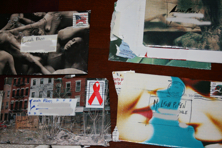
Hi- First off, Emily, love the envelopes. What a creative and humorous outlet for your talents. Secondly, Wed's exhibit was worth facing down the Troll at the art museum entrance. Imagine the nerve of art students going to an art museum to look at art!

I loved everything that Duegaw had on the wall- from the drawings, the poems and finished pieces. I could have spent hours longer looking at Fisch Hause Studies. What I love about this work, and didn't notice till looking at it in person, was all the areas of unpainted drywall used in the composition and how they seamlessly blend in with the rest of the colors and images. Also, you can really see the difference in the heights of all the the constructed pieces. Sometimes, they have smooth edges and sometimes they have rough. (Kind of like the real life images he captures so well.) I love the lines from the original drawings, the graffiti , use of text, notes, etc. on the drywall. Not only do many of his works actually depict an artist's loft/studio, but the works give off this vibe all on their own. I think Royce Smith nailed it (no pun intended) when he wrote in the brochure intro that Duegaw's work serves to, ". . . salvage and reassemble the fragments of everydayness and exceptionality."

You really do have to look more than once to absorb all that is going on in these images. Then you are rewarded with with noticing extra lines, shadows, ephemera and humor. I love the cut outs in Two Rooms with Insufficient Light. I also like how the artist drew a gun right on top of an ACE Hardware bag. The accompanying sketches were really interesting and those along with the film of Dewgaw creating his art really gave insight into his creative process. Finally, I have also been thinking about Outside Kent's Studio with the Elevator Light Left On. His frames with textured paint, lines, lines, lines, lines, different woods and under drawings are all things to ponder over- at least for me.

Sunday, April 12, 2009

Handmade Envelopes - Emily Ritter

Lately I have been on a real kick about mailing people things and getting really creative with it. Recently, I wrote a letter to a friend in San Fran and went all out. I made the letter itself be the envelope by taping up the sides and apparently making it impossible to open. Regular envelopes are just plain boring. I think that mail should make people get excited. So, I googled it and found some pretty interesting ones. 
One I made (didn't draw it, just slapped it together.)


Saturday, April 11, 2009

oops

It dawned on me around 10:00 this a.m. while I was in the school library that I forgot to blog this a.m. Oh well. I wanted to say that I really enjoyed everyone's presentations last Mon. in class. They were all really interesting and I love how we are so eclectic in what we like. I guess that is not unusual among creative people. Anyway, I am really looking forward to hearing the rest of the presentations.

I also met with my adviser this morning and I am very excited about taking sculpture next fall. I have wanted to learn to weld and sculpt metal for a while and now I will have the chance. I wonder how many people are taking printmaking? Happy Easter to all who celebrate it and I loved the eggs. ann

Printmaking

For starters I know that some of us have taken printmaking and I would definitely encourage those who haven't to do so. I think we all realized how much fun it is to make prints. I've always liked printmaking but I am very sloppy. When Monika had discussed that one of her teachers told her she would make a poor printer and proved her wrong I felt a lot better.. and that messy work is often sometimes someone's trade mark.

One of my favorite printmakers of all time is Albrecht Durer. He also did drawing and painting which is equally great but having experience with making prints I am amazed at the intricate designs and his extreme detailness. He has incredibly detail and I really love his subjects.

Biographical.. http://www.boglewood.com/cornaro/xdurer.html.. http://www.metmuseum.org/toah/hd/durr/hd_durr.htm

This is probably one of my favorite works of his.. http://www.metmuseum.org/toah/hd/durr/ho_18.65.8.htm
There are so many things going on in this work that it almost feels like a scavenger hunt. The time period in which he made his works has a huge impact on what he makes.. and I kind of like how he has such graphic works. I think a lot of peopleare afraid to state their opinions through art.. My family always likes landscapes and portraits which are kind of disappointing to me. I feel like they are too safe. I will agreeagree that I am scared to try diffferent techniques but I think when people come up with unique compositions or subject matters the piece is a lot more interesting.

Adrean

Final Friday

Well.. actually it was First Friday which I think caused a lot of confusion. A whole bunch of people kept asking me if they still had Final Fridays or not.. but anyway. I went to Shiftspace looking for Michael's and Emily's work.. when I couldn't find Michael's and found out they had not placed it up in the show I felt extremely bad for him. Whoever set up the gallery should've informed Michael. At the same time I realize that Monika didn't have much control over it and her explanation in class.. not only worried me but gave me drive. I understand that sometimes a work of mine might not get into a gallery but I also think that if a gallery does not inform the artist it reflects the image of the gallery poorly.

I don't quite understand the performance pieces. I mean they are kind of fun to watch but I feel like I'm watching an old movie.. I think of how people say, "anything can be art." Perhaps it's not my cup of tea.. but it always seems to me that performance art has to be something incredibly weird espcially from what Ann has told me about her class.

My favorite piece there was by Chiyoko Myose titled "when the light appears in their hiding places"It was basically a painting with random blocks painted on it.. I really like the color scheme. The yellow really advanced from the dark background. I also like the fact that these squares weren't perfect.. they were stretch and almost looked like a weaving instead.

I think Mike's piece lacked from my expectation. I think the piece would be a lot more successful with more wheat. And that .. box.. ...........

-Adrean

Friday, April 10, 2009

Everywhere. All the time.

I have recently been noticing art everywhere. I know that sounds very strange coming from an art student. But still it seems that everything around me starts to get analyzed. Color schemes in restaurants, landscape composition, menus, billboards, peoples wardrobes... I am finishing up decorating my room and it fits the same guidelines. Balance, symetry, etc. It just made me realize that the possiblities are endless with an art degree. And like Lyndsey said the smallest everyday things can become extrordinary when they are focused upon. I am just finding that the more time goes on the more I enjoy where my life is going. It is very exciting.

Easter Eggs!

That's right: Easter Eggs. This Friday I was stuck at home with the family, so we decided to dye Easter eggs. It was interesting to so how my family approached color in comparison to the way i approached it. After learning so much about color this past semester, I thought it was interesting how the family was able to use techniques for mixing, matching, and using colors successfully. At first I dreaded the idea of dyeing eggs for the millionth time, but after it was all done, I really enjoyed it. Not only did I get to spend time with my family, I also got to make art in a different way.


-Daniel


These are just a few of the eggs, and they are a little hard to see.

Blog

On Wed. My 3-D design class participated in a performance piece for a student. I thought at first why the student(artist) was making us open bottle caps but I actually was surprised as to how interesting it really was. The sound it made were somewhat relaxing. And I'm interested in seeing what the video looks like in the end.
~ Lyndsey

Bloggin'

First off I wanted to say to Aerica that I hope everything goes okay and that your Grandfather gets better.I was reading Aerica's post and the second half made me think. Her she is talking about how she's putting all of this feeling and emotion into her work and I don't feel like I've ever put anything of myself into my work. Which raised the question of can you not put yourself into the work or do you always, even if you don't realize that you're doing it? I want to say that artist always put themsleves into their work because that's what I'm taught but I don't feel like I put me into my work, I just feel like I am doing what I am told. Maybe I don't see me becuase I am me....

Laura

Thursday, April 9, 2009

Making Art Personal

This week has been very.. well, I'm not sure what a word for it is. Basically, in a nutshell, several distant relatives over the last month have been suffering some pretty severe medical problems. While, yes, I could recognize that it was a sad situation, it did not completely affect me. However, over the last two weeks, my Grandpa (who may as well be my Dad) has contracted a bacteria or virus or something. In a two week's time, he went from running daily outside to being out of breath just from walking across the room to having to use an oxygen tank just to function. This morning, he went into surgery so hopefully the Docs could figure out what's going on and fix it. My Grandpa is normally a healthy person who has never smoked. He hasn't had any history of asthma or any other breathing issues. This sudden change is very difficult for my entire family. It just isn't him.

So, back to the idea of art, I have learned this week just how much our daily lives affect what we do in both life and art. It affects how we think and how we release our feelings and thoughts. I mean, especially lately with all of these "portrait" and "self-portrait" projects that I've been getting (which have conveniently been at least three within these trying two weeks)--when taken seriously, they really force you to confront how you feel. It forces you to have to confront the reality that someone you love will die. And it may not happen peacefully in their sleep. I could always understand how art is supposed to be theraputic for the mind, but I've never actually tried. It's kinda funny how after I started, I couldn't seem to do much of anything without incorporating my feelings about all of this. I think it gives the art a greater meaning. A bigger purpose. To me, I think that feeling of intimacy is also relayed to the viewer. Maybe artists should be chronically tormented for the sake of the public... I mean, look at what happen to Van Gogh.

-Aerica

Saturday, April 4, 2009

Blog

So, over the weekend I have been researching Andy Warhol for the assignment due on Monday. I'm not going to go into detail about him so I have something to talk about on Monday but I found him very interesting and odd in a good way. I find all of his artwork to be simple and yet very strong in meaning. He said something I thought was clever, which i'm not going to tell not until Monday.
I think my absolute favorite screenprint of his is of Marilyn Monroe. I myself enjoy drawing Marilyn Monroe. I actually recreated the screenprint that Andy Warhol did of her and have it over my bed. I think Marilyn Monroe is really fun and easy to draw. Also I dont remember who told me this but someone told me that Marilyn Monroe, Adury Heburn and Elizabeth Taylor all have the same face sturctures which make them the most known Beauty icons in the world. I just thought that was interesting, which is why I think Andy Warhol enjoyed making prints of them because he knew people knew them and would maybe focus more on his artwork.

~ Lyndsey

Final/Faux/First Friday...with a twist...

So for the last few weeks I have been so pumped to go and see not only my peer's work hung in the Current presentation of work at WSU ShiftSpace but mine as well. Inviting friends and family to come and help me share the excitment of having something in a gallery I found that mine was not installed. After talking to three graduate students I found out that some of the work had to be axed due to the emense amount of work displayed. I was not that upset about my work not being up, but more of that fact that I was not notified and had my family and friends looking at me like I was crazy. On the other hand it was very nice to get to see the work of my other schoolmate's work and excitment in the gallery (Emily & Laura ;-]).

I thouroughly enjoyed the mixed media that was presented at City Arts with the use of painting drawing and print making. I went and viewed some other work down on commerce street that I enjoyed alot one dealing with new and old that used alot of paper cut. Some photography of lights. Ceramic creatures. Then making my way back near the warren to finish up the night with a drum jam session in the middle of the court with some friends.

I relish any chance I get to take a minute from the busy world I call my life to view art and listen to music. Final/Faux/First Friday did that for me even with the unexpected events that occured early that evening.

Friday, April 3, 2009

Final Friday and Other Happenings - Emily Ritter

It was weird to have final friday and first friday crammed into one. I did really like that. Current was interesting. It was nice to see what other students were working on, but I was disappointed that my piece was hung incorrectly (I should have written it down) and was EXTREMELY disappointed that Michael's piece got axed. City Arts had some nice things up, and it was great to hear a friend's band play while looking. Tanget Lab was a snoozefest, except when Spirit of the Stairs played. Amazing. 

I really enjoyed experimenting with printmaking on Wednesday. I hope we get to do it again. So many ideas of things to try are now running through my mind. 

Re: Glassblowing

Like Laura, I've been fascinated by glassblowing since I was young. Growing up, my family always had beautiful glass pieces. I was always amazed when I realized some person was making that, not a machine. I recently watched a glassblowing show on KPTS. The skill involved in making these pieces is insane. I remember that some guys were making this big elaborate piece, and one of them dropped it. They didn't even care; if it was me, I'd be upset. I have been debating on taking a glassblowing class for a year or so, and I think I'm going to this summer. The only place I know of is CityArts. If anyone knows of another place, please let me know.

-Daniel

Disappointment

I saw Laura (I drove past her, she didn't see me), Adrean, and Emily at Shift Space tonight. I was very happy to see Emily's collage up on the wall, but I was very disappointed that there wasn't enough room for all the RSC gallery winners' work and that Michael's in particular had to be cut. I know that everyone's work would have been shown if space allowed and I am sorry that the reality of last minute cuts had to surface at this event. I hope that the works not hung tonight will get a chance to appear at a futrue Final Friday. There was a lot going on in Shift Space tonight, including a performance art piece and space was at a premium.

On a more positive note, I agree with Jordan that Wed.'s class in the print making lab rocked! That was really fun and helped me understand more about why Monika encourages us to draw on top of other drawings. I loved the freedom of experimenting with color and texture and also using negative and positive space. I thought everybody made some really creative, interesting and beautiful things in class. ann

Margaret's brief contribution for the week

A quot from Albert Einstein: "The intuitive mind is a sacred gift and the rational mind is a faithful servant. We have created a society that honors the servant and has forgotten the gift."

Because I'm not sure if I'll remember to wake up...

... I'm posting this now. While I will be attending Final Friday tonight, I'm going to mention Jeff Schmuki. Awesome name, doncha think? Anywho, he came and spoke this last.. well, sometime this last week (is it just me, or did time really drag?). His work proved interesting; I mean, he used plants--specifically chia plants--as he main medium. But there was something about most, if not all, of his work that just felt like he wasn't pushing it far enough. I mean, he was pushing the concept of the chia just about as far as you could, but I don't feel that he really explored the combinations. Everything felt like he was running through a mansion and opening up all the doors, but never walking into the room. Still, that was just how I felt about his work. I did rather like his sculptures, though. They felt complete. I mean, they felt like a complete thought. I wish he could do more.

-Aerica

Thursday, April 2, 2009

Printmaking

I was really glad and excited to be able to spend last class in the printmaking studio. I think it is exciting to be able to have more creative freedom and not just be trying to draw what you see. I also was glad to be exposed to a new and exciting form of art and was reminded of why i wanted to come back to school, to learn about things that excite me. I found an interesting website that allows printmakers from around the world to post their work for our viewing pleasure.http://www.printmakers.info/. You should check it out.

Jordon May

Wednesday, April 1, 2009

Glass blowing - Laura

One of the forms of art (well I consider it art) that completly facinates me is glass blowing. I've only been to the museum here in Wichita a few times but both times I just wanted to spend hours walking on the floor where underneath you in hundreds of glass blown bowls and other things I also want to look at the huge glass sculpture hanging in the center of the lobbyish area. Even the little glass figurines that you see at like Hallmark are stunning to me. I think it fascinates me so much because I don't know how the artist does that and to me glass is so fragile and to make anything that beautiful out of it is crazy amazing to me. Glass blowing is fantastic and will always be at the top of my list. Is glass blowing one or two words?